
Start With One Colour Lead, Not Five
The easiest way to make a gift feel polished is to choose one lead colour and let everything else support it. Too many colours can make a hamper or wrapped box look busy, while one clear direction gives the whole gift a calm, intentional feel. For weddings, corporate gifts and seasonal client packs, that visual discipline matters just as much as the contents inside.
Think of the lead colour as your anchor. It can come from the event flowers, a company logo, a bride’s palette, or even the tone of the product itself. In Sandton, we often see clients choose one main colour and then use two softer companions so the finish feels layered but not loud. That is usually the sweet spot.
- Choose one lead colour for the wrap or box.
- Add one neutral to give the eye a rest.
- Use one accent colour for ribbon, tags or filler.
If the gifting is for a corporate launch, keep the palette aligned to the brand but avoid using every colour in the logo. A single strong tone with a clean neutral can look far more expensive than a crowded mix. It also photographs better, which helps when the gifts are being shown at an event or sent to multiple offices.
Match Texture To The Mood Of The Gift
Colour is only half the story. Texture changes how the colour reads, especially in bright South African light. A matte wrap in dusty blush feels soft and elegant, while a satin ribbon in the same shade catches the light and adds a more formal finish. If you are packing hampers for a wedding, a textured mix can make the gift feel warm and personal. For a boardroom handover, a neater finish usually suits better.
In coastal areas like Durban and Umhlanga, humidity can affect paper and ribbon handling, so it helps to choose materials that keep their shape well. In hotter inland conditions, storage matters too, because curled paper edges and crushed corners can spoil an otherwise beautiful presentation. Small details like this make a big difference when you are packing in bulk.
- Use heavier paper for structured corporate packs.
- Choose softer textures for bridal or baby gifting.
- Store ribbon and wrap flat in a cool, dry place.
- Keep glossy finishes for smaller accent details, not the full gift.
The aim is to let the texture support the message. A luxury hamper with a calm palette and crisp ribbon feels different from a playful seasonal gift, and that difference should be deliberate.
Build A Palette Around The Occasion
Every occasion has a natural colour language. Weddings often lean into ivory, blush, sage, gold or champagne. Corporate gifting usually works best with navy, charcoal, forest green, black, cream or one brand accent. Festive gifting opens the door to richer colour, but it still needs some control or the result can feel cluttered.
For clients ordering from Rosebank or Bryanston, a practical approach is to tie the colour story to the event purpose. If the gift is a thank you, use quiet tones. If it is a launch or announcement, a stronger contrast can feel more appropriate. If the gifts are being delivered to several recipients across Cape Town and Durban, consistency matters even more, because the same palette should hold up across every pack. That is where a clear style guide helps.
- Wedding favour styling: ivory, blush, sage and soft gold.
- Corporate gifting: brand neutral with one accent colour.
- Seasonal gifting: deeper tones with one bright detail.
- Client appreciation gifts: soft natural colours with minimal contrast.
A good colour story should feel easy to repeat. Once the palette is set, the rest of the decisions become quicker, from ribbon choice to gift note colour and hamper liner. It saves time when you are packing 20 gifts or 200, and it keeps the finish tidy.
Use Ribbon As The Final Accent
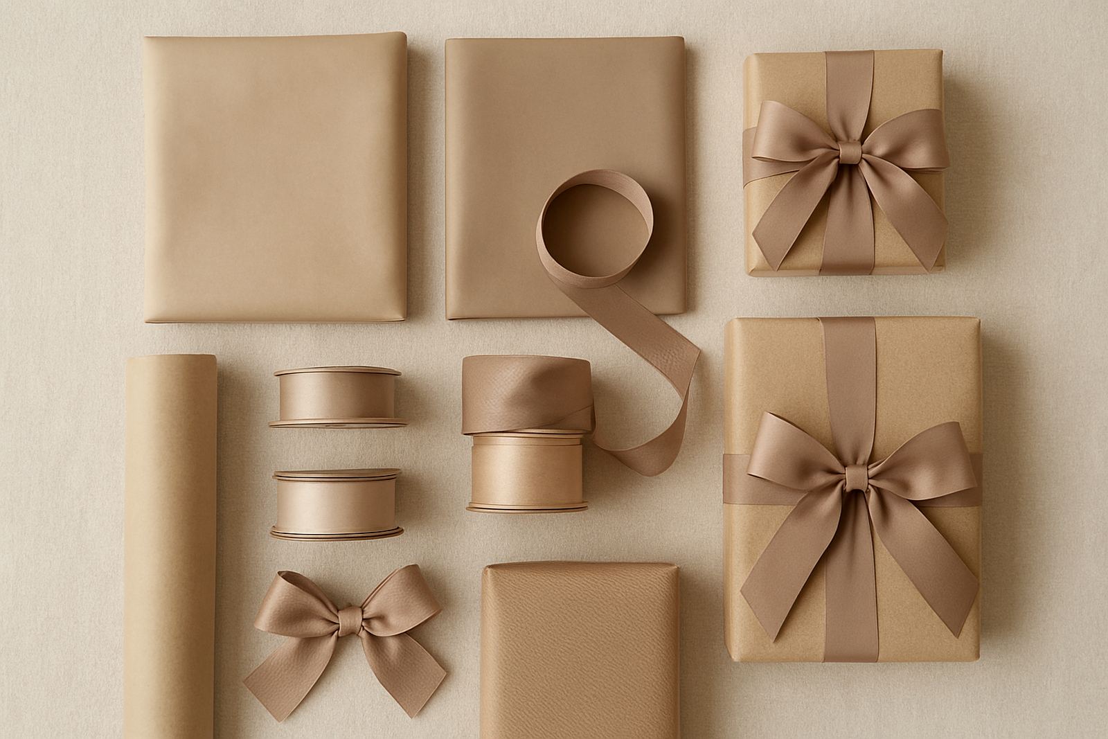
Ribbon is often the detail people notice first. It can sharpen a soft palette, soften a dark one, or bring all the elements into balance. Wide ribbon feels formal and works well for larger boxes or hampers, while narrower ribbon suits smaller wrapped gifts and favour boxes. If the colour story is already strong, ribbon should support it rather than compete with it.
There is a useful rule for ribbon selection: if the wrap is patterned, keep the ribbon plain. If the wrap is plain, you can add a ribbon with more character through texture or tone. Personalised ribbon is especially useful for weddings and corporate programmes because it adds a sense of purpose without making the gift feel overdone.
- Plain wrap pairs well with textured ribbon.
- Patterned wrap works best with a simple ribbon.
- Dark palettes need enough contrast to stay readable.
- Light palettes benefit from a slightly deeper ribbon tone so the finish does not disappear.
We often advise clients to think about the untying moment as much as the opening moment. A ribbon that holds its knot well and keeps its colour under bright light can make the whole gift feel more considered, even before the wrapping paper is lifted.
Keep The Inside In Step With The Outside
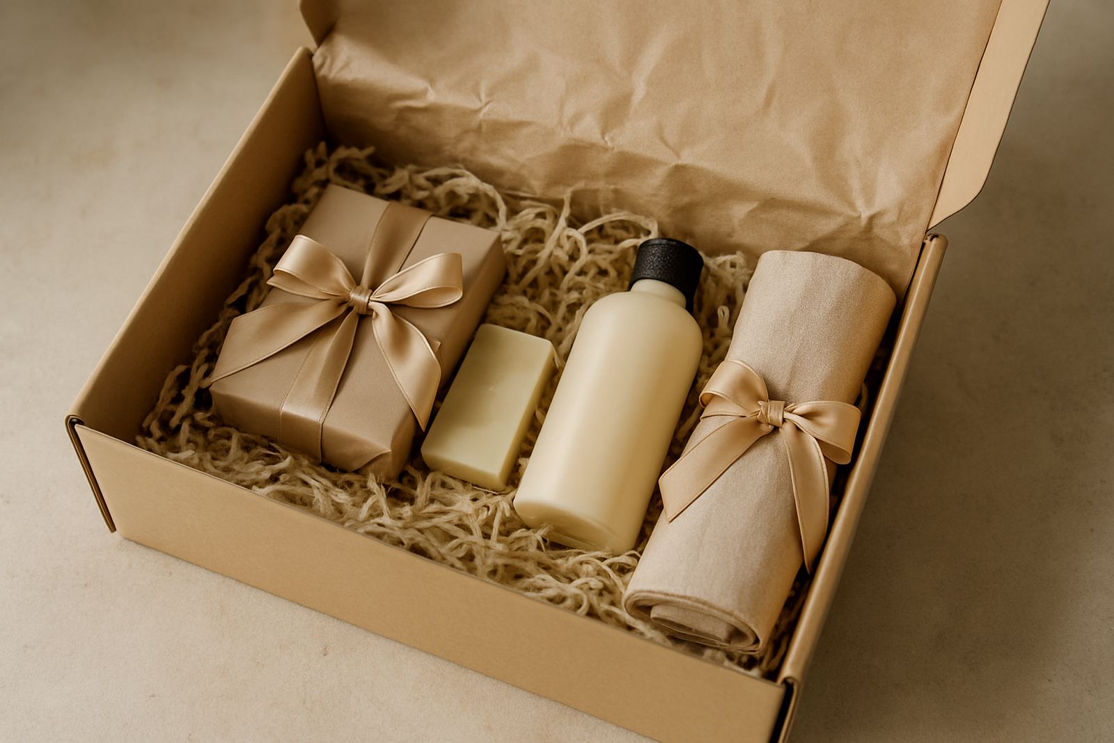
A colour story should continue inside the gift, not stop at the paper. Tissue, shredded filler, product labels, tags and gift notes all contribute to the final look. If the outside is calm and elegant but the inside is random, the whole effect loses strength. This is especially true for boxed hampers, where the recipient sees the inside first.
Practical colour coordination inside the box also helps with bulk packing. When every component follows the same palette, staff can pack faster and fewer items get mixed up. That matters for seasonal orders, event gifting setup and collection delivery coordination where timing is tight and there may be multiple drop points.
- Match tissue to the main wrap colour or neutral tone.
- Keep filler within the same colour family.
- Use gift notes that sit comfortably in the palette.
- Avoid adding bright unrelated items unless they are part of the brief.
For corporate packs, this is where a subtle brand colour can really earn its keep. A navy note card in a cream box or a green ribbon on a charcoal hamper can feel refined without shouting for attention. The important thing is that every layer speaks the same visual language.
A Sandton Example For A Wedding And Client Mix
One useful local example is a Sandton based wedding weekend that also included corporate thank-you gifts for key guests. The wedding palette used ivory, dusty rose and muted green, while the client gifts had to feel more formal. The solution was to hold the same ivory base across both sets, then shift the accents. The wedding favours carried rose ribbon and soft floral notes, while the corporate packs used deep green ribbon and a cleaner printed card.
That approach worked because the gifts were related without looking identical. It also made packing easier for the team in the studio, with the same base materials shared across the job and only the top layer changing. For mixed orders like this, a focused colour story keeps the whole project manageable and the final presentation consistent.
Local conditions also played a part. The gifts were collected in the afternoon and delivered across Gauteng the same day, so materials needed to hold up well in heat and traffic. A tidy colour plan helped the packing team work quickly and left less room for errors.
Why Colour Planning Saves Time And Money
Good colour planning is not only about style, it is about efficiency. When the palette is set from the start, fewer samples are needed, fewer changes happen mid-order, and the packing process becomes cleaner. That is useful whether you are styling 12 wedding favours or a larger corporate roll-out for different branches. It can also reduce waste, because you are not opening extra wraps and ribbons that never get used.
It helps to keep a simple list before you place the order, especially for larger gifting programmes in Cape Town, Durban or Sandton:
- Main colour for wrap or box.
- Secondary colour for ribbon or lining.
- Accent colour for notes, tags or filler.
- Quantity per recipient and any split between branches.
- Collection or delivery timing, especially around month end and festive periods.
When the colour story is planned properly, the gift looks ordered from the first layer to the last. That is what makes it memorable. Not noise, just a clear choice carried through with care.