
Why one colour can look more expensive than many
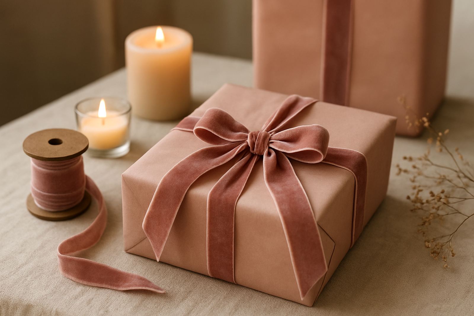
A single-colour wrapping scheme looks tidy because there is less visual noise. When the paper, ribbon, tag and hamper fill all sit in the same family, the eye reads the gift as intentional rather than busy, and that usually feels pricier.
Monochrome also suits the South African way of gifting where the present may need to move from office reception to car boot to event table before it is opened. A strong, simple colour holds its shape through that journey. Whether you are packing ten executive gifts in Sandton or thirty thank-you boxes for a Bryanston launch, the finish still feels controlled.
It helps that monochrome photographs well too. For wedding welcome gifts, staff appreciation packs or client hampers, a clean black, white, navy or forest green wrap can look polished under indoor lighting and on a sunny patio in Cape Town. That is not a small thing when the box has to make its first impression before anyone sees what is inside.
Choosing the right monochrome palette for the occasion
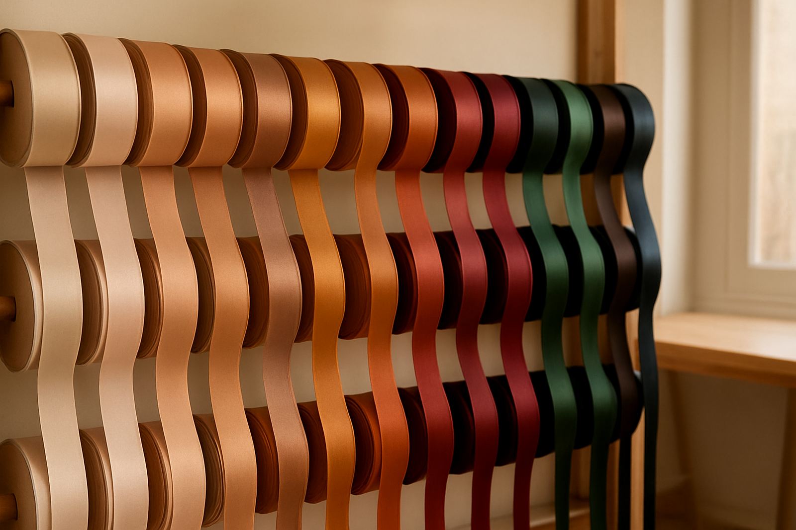
Not every single-colour scheme should feel the same. A wedding favour usually needs softness, while a corporate year-end gift may call for a darker, more formal tone. The trick is to pick a colour that suits the message, then keep the rest of the details quiet.
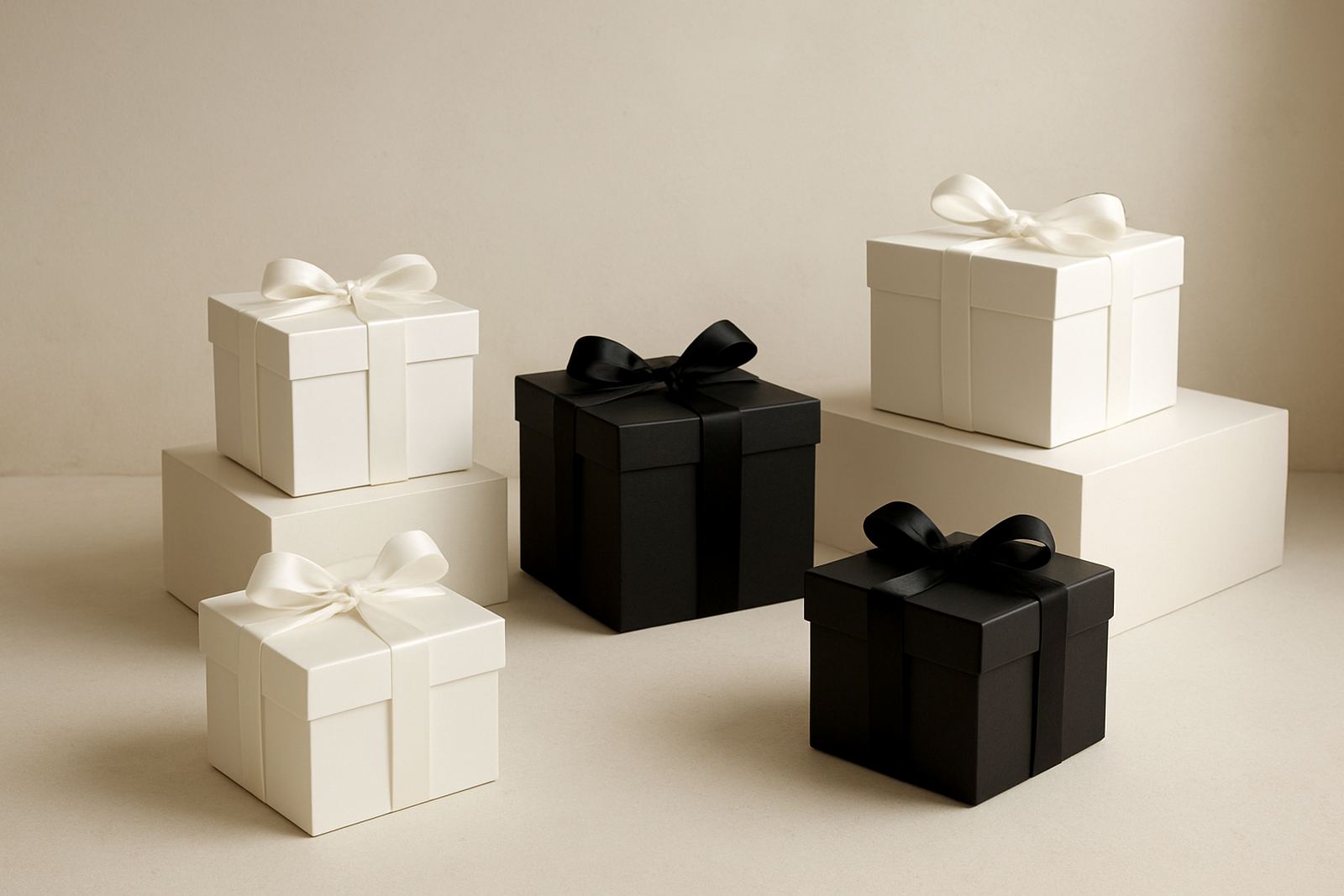
- White or ivory: Best for weddings, baby showers and classic luxury hampers.
- Black: Strong for executive gifting, menswear launches and premium event packs.
- Grey or charcoal: Good when you want modern and practical without the harshness of pure black.
- Deep green or navy: Works well for corporate programmes and festive gifting with a calm feel.
- Blush or taupe: Suits softer styling, bridal gifting and boutique product launches.
In humid areas like Durban, darker papers can show scuffs less easily, while lighter papers may need a careful finish to keep them crisp. For coastal events, we often suggest ribbons and labels that sit well with moisture and movement so the look stays neat from packing to delivery.
How texture keeps monochrome from looking flat
Monochrome does not have to mean plain. The real interest comes from texture, fold direction and finish. A matte wrap with a satin ribbon feels different from a smooth gloss paper with a cord tie. Even when the colour stays the same, the contrast between surfaces gives depth.
For example, an ivory hamper can be lifted with ribbed ribbon, tissue lining and a lightly textured box. A black gift can feel more expensive with a soft-touch wrap and a narrow, clean satin bow. The point is not to add more colours, only to add a little variation in feel.
That approach also helps when the gifts are stacked or packed in bulk. In a busy corporate order, clear texture differences can make sorting easier for the packing team and quicker for the client receiving them. It saves time and still looks refined, which is what most people want when deadlines are tight and the load-shedding schedule is not helping.
A practical way to style monochrome hampers for events
If you are styling a monochrome hamper for a wedding, conference or product launch, start with the box or wrap first, then build the rest around it. Keep the label, note card and ribbon in the same tone or just one shade lighter or darker. That small shift keeps the gift clean instead of dull.
- Use one main colour and one supporting texture only.
- Match the note card to the ribbon rather than adding a third colour.
- Choose filler paper that stays tucked neatly in transit.
- Keep branding small and precise so the gift still feels personal.
- For bulk orders, test one finished pack under event lighting before the full run.
For a Cape Town brand dinner, a charcoal wrap with a black ribbon can look quietly formal on a table setting. For a Rosebank client send-off, ivory wrapping with pale gold notes may feel more welcoming. The key is consistency, because even a tiny change in shade can make a whole batch look mismatched.
Monochrome for corporate gifting and brand discipline
Corporate gifting often needs to carry more than a nice look. It has to reflect the company without shouting. Monochrome suits that need because it allows the message card, event stamp or ribbon print to do the branding work while the packaging remains disciplined.
That is especially useful for repeat programmes. If a company sends monthly staff gifts, quarterly client hampers or seasonal thank-you packs, a fixed monochrome scheme creates recognition. People begin to associate that clean finish with the business itself. Over time, the gift feels planned, not random.
It also makes logistics simpler for collection and delivery coordination. A fixed colour scheme means one set of materials can cover a range of items, from candles and stationery to food hampers and celebratory boxes. When stock is predictable, packers can move faster and the final result stays consistent across Sandton, Rosebank and Bryanston deliveries.
When a monochrome look should stay simple and when it should be softened
Not every gift needs a dramatic finish. Some should stay very restrained, especially when the contents are premium on their own. A carefully wrapped bottle, a luxury candle set or a small executive hamper can feel complete with little more than one colour, one ribbon and a neatly written note.
Other gifts benefit from a softer touch. If the present is for a wedding favour table, a baby arrival or a thank-you gift for a valued client, a monochrome base can be warmed with a handwritten note, a personal ribbon message or a slightly looser bow. That keeps the overall scheme clean while still feeling human.
In our experience, the best results come when the styling matches the occasion rather than the trend. A monochrome box for a formal black-tie event should not fight for attention. A monochrome hamper for a family celebration should feel calm and generous. Simple is often the stronger choice, but it still needs a thoughtful finish, otherwise it can read as bare.