

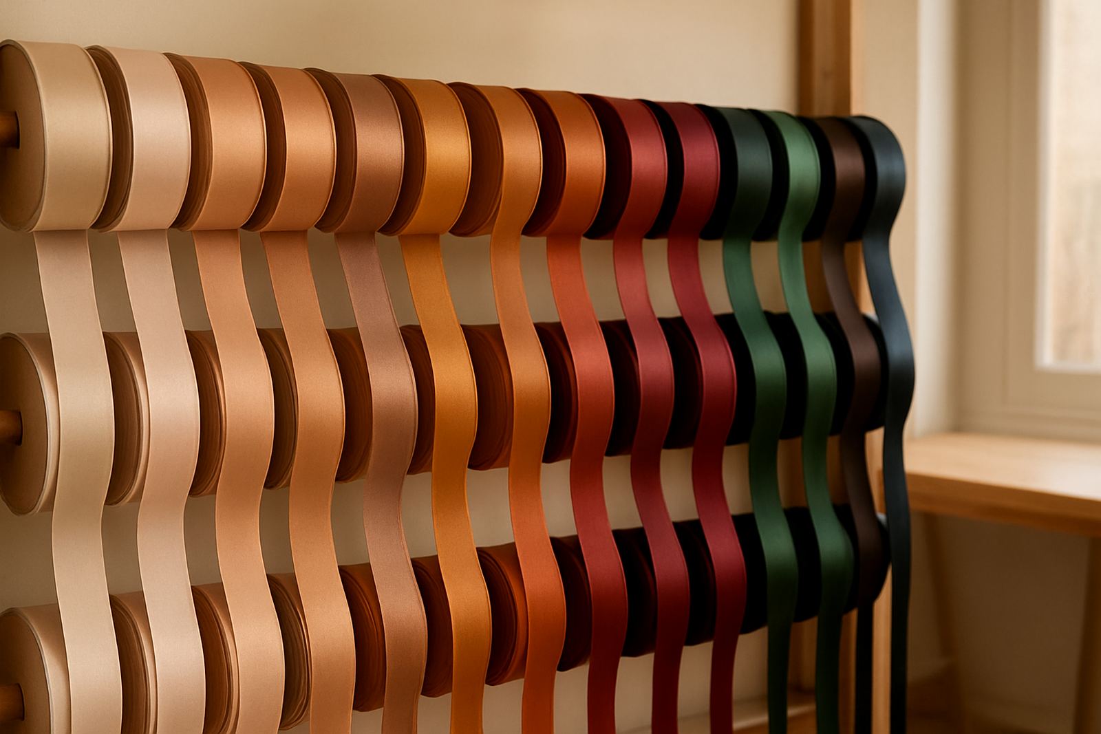
Why ribbon colour matters before the gift is opened
When a gift is handed over, the ribbon is often the first thing people notice. Before the paper is torn or the lid is lifted, colour has already set an expectation. A soft blush ribbon suggests care and tenderness, while a deep gold ribbon can signal celebration, prestige or achievement. The colour does not have to say everything, but it should say something clear.
In South African gifting, that first impression matters because gifts are often tied to moments that carry more than one meaning. A wedding favour, a corporate thank-you, a baby shower hamper or a seasonal staff gift all need a different tone. A ribbon that feels right can make the whole package feel thoughtful, even before the note is read.
Warm colours, soft colours and what they usually communicate
There are no hard rules, but colour psychology gives a useful starting point. Warm colours tend to feel lively and direct. Soft colours feel gentler and more intimate. Darker tones often feel formal or premium. The trick is to match the colour to the message, not just to what looks pretty on the roll.
- Red can suggest love, energy and strong emotion. It suits romantic gifting and festive occasions.
- Pink often feels affectionate, delicate or celebratory. It works well for weddings and baby related gifting.
- Gold reads as premium, festive and honouring. It is popular for corporate milestones and year end hampers.
- Silver feels cool, neat and polished. It suits modern packaging and formal events.
- Green can suggest freshness, growth and calm. It is a strong choice for natural themed hampers.
In practice, the finish matters too. Matte ribbon feels understated, while satin catches light and feels more polished. A shiny ribbon in a bright colour can look festive, but if the gift is meant to feel sincere and personal, a softer texture may be better.
Matching ribbon to the occasion, not only the recipient
A common mistake is choosing a colour only because it is the recipient’s favourite. That can work, but context matters just as much. A ribbon for a wedding favour in Stellenbosch will not carry the same brief as a staff gift for a December function in Sandton. One needs romance and ceremony, the other needs order and consistency.
For weddings, colour can mirror the couple’s palette, venue styling or season. For corporate gifting, ribbon should align with the company image without becoming too loud. For birthdays, graduations and thank-you gifts, you can be more personal and playful. If the gift is being delivered across Johannesburg, Durban or Cape Town, the ribbon also needs to travel well and still look neat when it arrives, especially in heat or coastal humidity.
- For weddings, use colours that sit comfortably with the table decor, florals and stationery.
- For corporate parcels, keep the ribbon colour consistent across the full order for a tidy presentation.
- For seasonal gifting, consider richer tones in winter and lighter shades in summer.
- For condolence or sympathy gifting, choose restrained colours that feel respectful and calm.
How ribbon colour works with paper, hampers and notes
Ribbon never works alone. It has to sit well with the wrapping paper, gift box or hamper basket, and even the wording on the note. A pale ribbon on patterned paper can soften a busy print. A dark ribbon on plain kraft paper can create contrast and make the package feel more deliberate. If the gift note is formal, the ribbon should not look overly casual. If the note is warm and personal, the ribbon should not feel stiff.
For boxed hampers, colour coordination is especially important because there are more surfaces to balance. A hamper with food items, bath products or branded corporate gifts can look cluttered if too many colours compete. One strong ribbon colour and one supporting accent are usually enough. At Bling Wraps, many clients choose one ribbon shade across all packs, then vary the width or texture to suit each gift. That keeps bulk orders orderly and still allows a little personality.
Local gifting examples from Sandton to Durban
A practical example helps. A Sandton finance team ordering 80 year-end hampers for clients might choose navy ribbon with gold accents. That combination feels refined without being flashy, and it works well with black or charcoal packaging. A Cape Town wedding couple may prefer dusty rose ribbon with ivory paper because it fits a softer coastal palette. In Durban, where humidity can be high, the same client may need ribbon that keeps its shape and does not slip when the parcels are handled before delivery.
For smaller gifts in Rosebank or Bryanston, colour can do the heavy lifting. A single ribbon around a compact box can turn a simple candle, scarf or chocolate selection into something special. In these cases, the ribbon colour should be chosen with the receiving moment in mind. Is it a thank-you, a celebration, a welcome gift or a farewell? Once that is clear, the right colour becomes much easier to choose.
Practical ways to choose ribbon colour without second guessing
If you are ordering for a private event or a company programme, start with the purpose of the gift and work backwards. Think about the message, the setting and the number of parcels. Then compare the ribbon to the paper and the note, not in isolation. A good ribbon should support the whole package, not overpower it.
- Choose one main message first: celebration, gratitude, romance, sympathy or welcome.
- Check the ribbon against the wrapping under natural light if possible.
- For bulk orders, test a sample on all packaging sizes before confirming the full run.
- Keep one backup colour on hand in case stock or lead times change.
- When in doubt, use a neutral tone with a premium finish. It is usually the safest choice.
That final step matters for corporate work and event gifting where consistency is everything. A small colour variation between parcels can look untidy, especially when gifts are photographed or handed over in a room with strong lighting. The aim is not perfection for its own sake, but a finished look that feels well planned.