
Start With The One Colour Guests Will Notice First
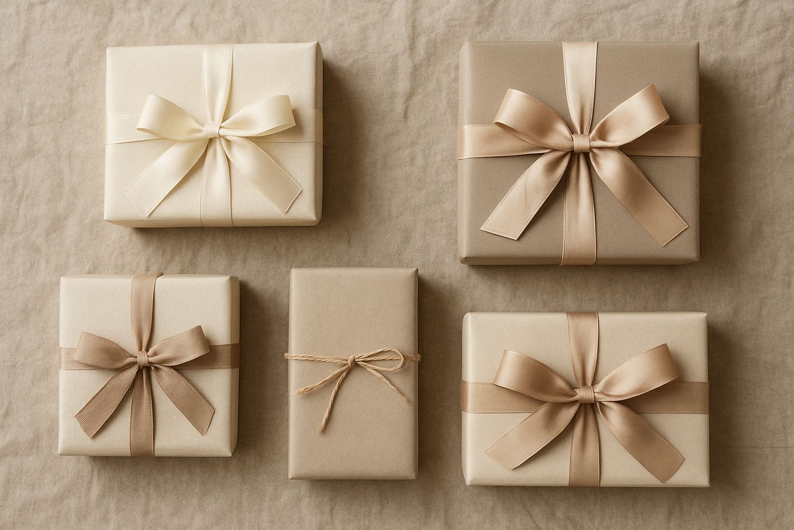
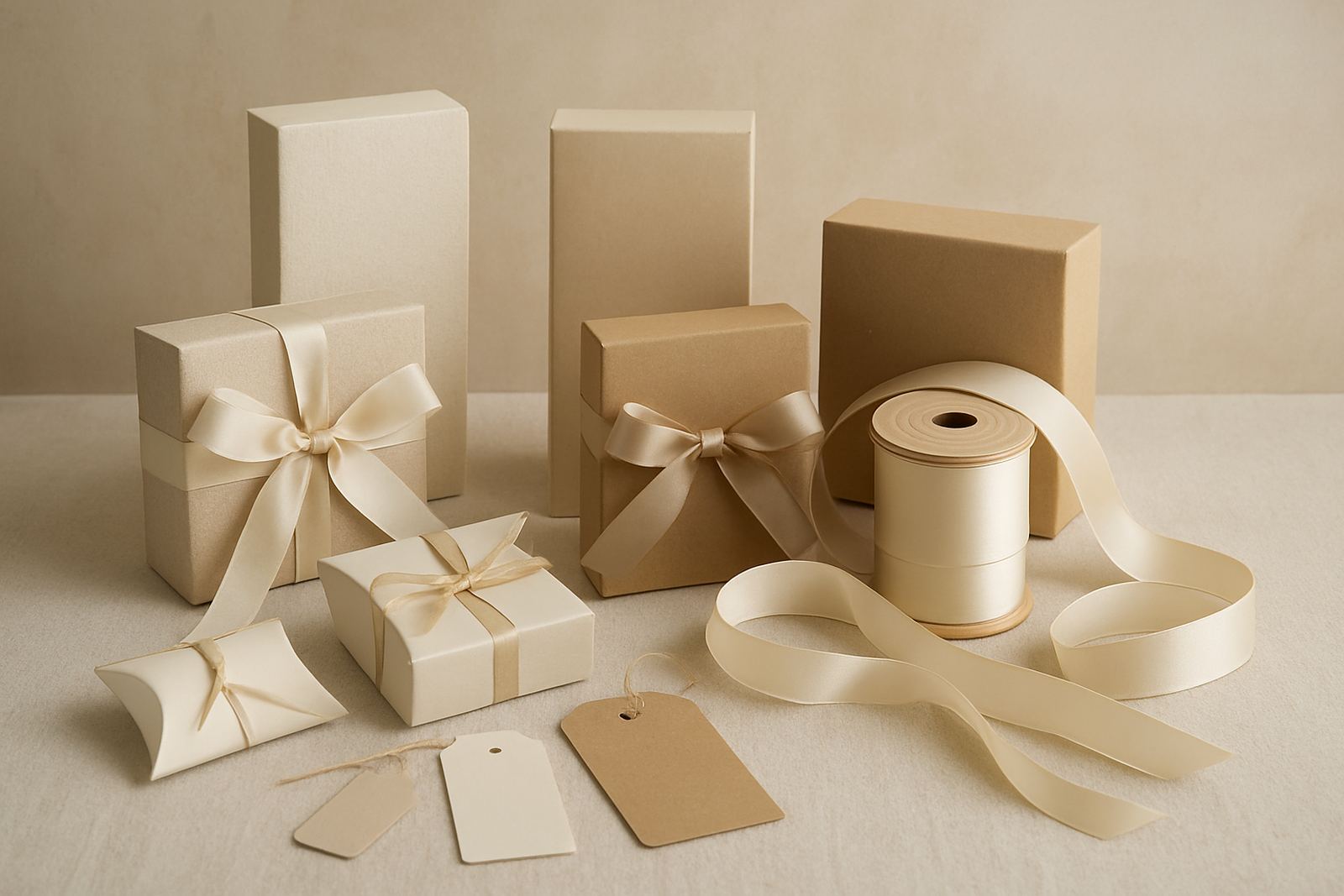
For favours, the wrap or box is usually the first thing guests see as they leave the table. That makes it worth choosing a colour that links clearly to the rest of the reception. If your flowers are soft ivory and blush, a warm nude wrap with ivory ribbon keeps the look calm. If your decor is richer, like burgundy and deep green, a darker wrap with a satin ribbon in a matching tone can carry that mood through the room. The key is not to match every item exactly, but to let each one sit in the same family.
In South African wedding venues, especially in Johannesburg and Cape Town where natural light changes through the day, colours can look different from the shade inside the hall to the late afternoon sun on the terrace. It helps to check samples in the actual venue light. A pale sage that looks gentle in a studio may read almost grey at a beachfront reception in Umhlanga, while metallic ribbon can pick up more shine under warm indoor lighting. Small test pieces save a lot of guesswork and a few hundred Rand too.
Match Flowers, Table Linens And Favours Without Overdoing It
A wedding palette works best when there is a main colour, a supporting shade and one neutral to give the eye a rest. Use that structure when choosing favour wrapping. If the florals are white roses with dusty blue accents, the favour wrap can be cream, the ribbon dusty blue and the gift note card a pale grey or soft white. That way the favours support the table instead of fighting with it.
When the tables already have patterned linen or bold napkins, keep the favour wrapping more restrained. A plain wrap with a textured ribbon can feel polished without making the setting busy. For outdoor weddings in Stellenbosch or coastal Durban, where wind and humidity can affect paper and bows, sturdy wrapping paper and well tied ribbon matter as much as colour. A pretty bow that slips loose by the time speeches start will not help the photo table much, hey.
- Use one main colour for the favour wrap or box
- Repeat one floral colour in the ribbon or tag
- Keep neutrals nearby so the table does not feel heavy
- Check how the colours look in both daylight and evening light
Build A Palette Around The Stationery Suite
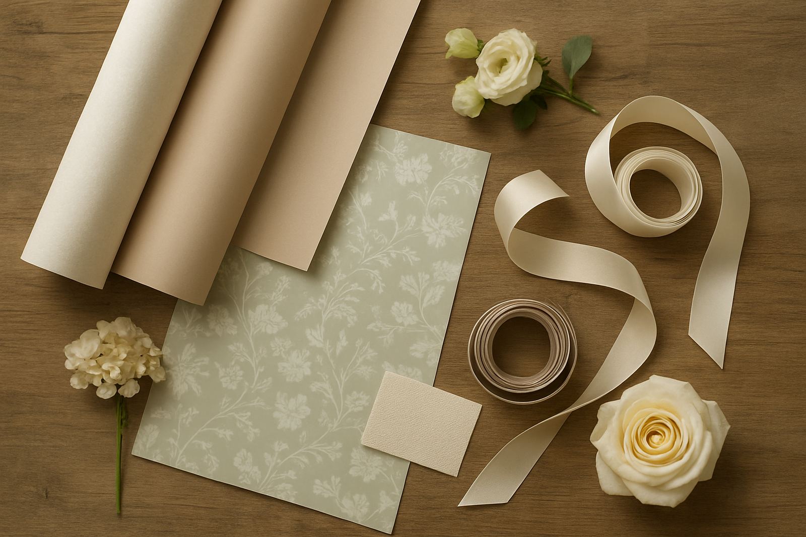
Stationery often sets the tone for the whole wedding, from save the dates to menus and place cards. If your invitations use eucalyptus green and ivory, those same tones can appear in your favour notes and ribbons. This creates a proper thread from the first envelope to the last gift on the table. Couples sometimes choose stationery first, then build the flowers and wraps around it because paper samples are easier to compare side by side.
For a more formal wedding, metallic foil on the invitation can be echoed in a narrow ribbon or a small printed tag. For something softer, hand lettered notes in muted tones work well with uncoated paper wraps and simple twine. The point is to keep the style consistent. A glittery favour box next to a very minimal menu can feel jarring, even if both colours are technically correct.
- Bring invitation samples to your wrapping consultation
- Match either the paper tone or the accent colour, not both if the suite is busy
- Choose one finish, matte, satin or metallic, and repeat it across key items
- If the stationery is very detailed, keep favour wrapping plain
Wedding Themes That Work Well In South Africa
Local weddings often draw from the season, the venue and the family story. A garden wedding in Bryanston may lean into greens, whites and soft pinks, while a winter function in Sandton may suit navy, silver and champagne. At a coastal ceremony in Durban, pale blue, sand and pearl tones can feel fresh without becoming too formal. These palettes are practical as well as pretty because they suit flowers, table settings and favour wrapping without needing loads of extra decoration.
For autumn and winter weddings, deeper shades tend to hold their shape visually across a large room. For spring and summer, lighter colours can feel more relaxed and airy. The trick is balance. If the flowers are already colourful, let the favour wrapping stay quiet. If the venue is neutral and the tables are simple, the favours can carry a brighter colour and become part of the decor. This is especially useful at larger guest counts where small details need to work hard.
Practical Pairings For Favours, Ribbons And Notes
Once the palette is set, the next step is deciding how each part of the favour will carry it. Paper, ribbon and note card all do a slightly different job. Paper gives the overall tone, ribbon adds contrast or texture, and a note can tie the story together with names, dates or a short message. At Bling Wraps, it is often easiest to begin with the box or wrap colour, then bring in ribbon samples and note layouts after that.
Here are pairings that usually work well for wedding tables:
- Ivory wrap, sage ribbon and a soft green note card for garden weddings
- Blush wrap, gold ribbon and cream notes for classic hotel receptions
- White wrap, black ribbon and grey notes for modern city weddings
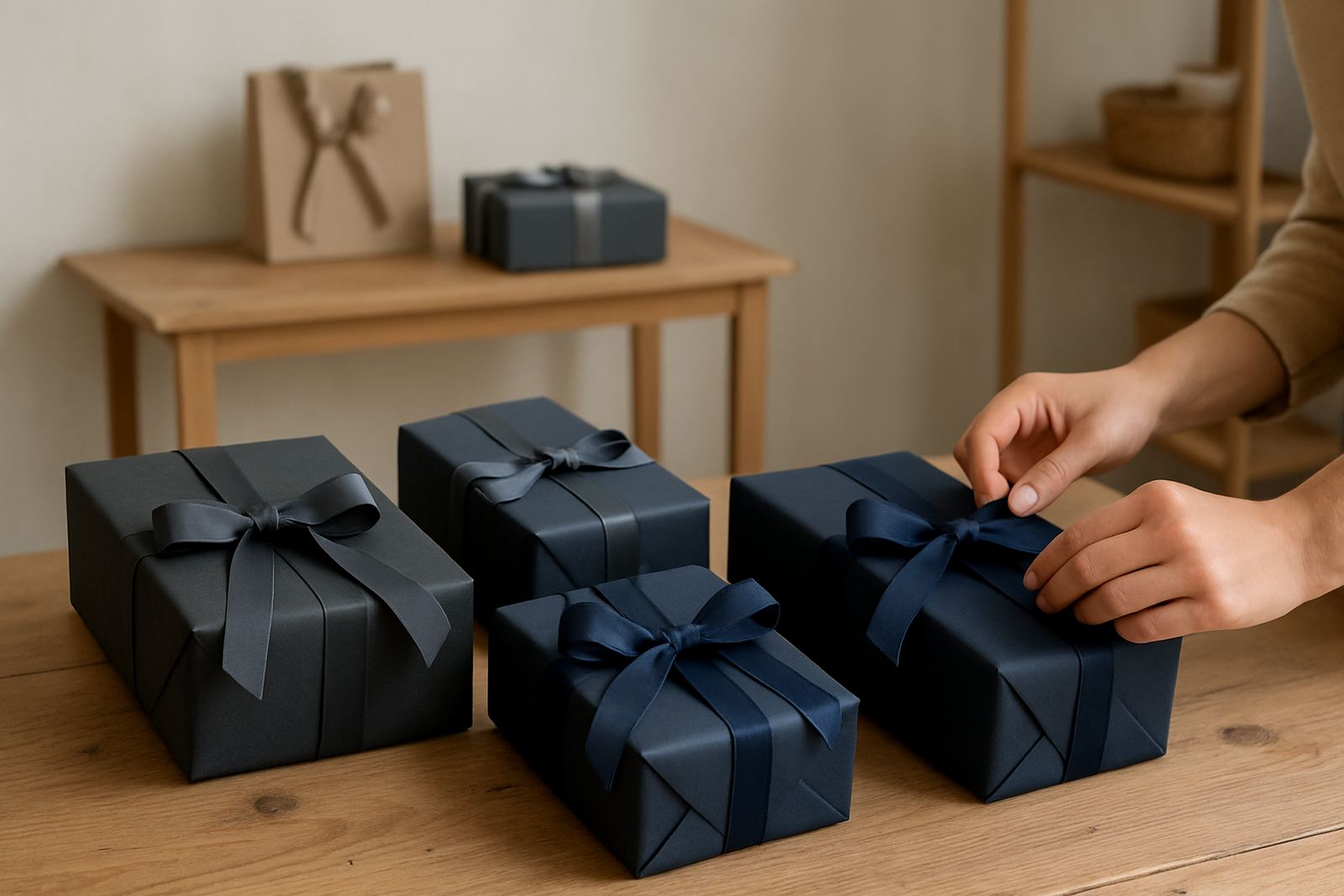
- Navy wrap, silver ribbon and white notes for evening celebrations
- Natural kraft wrap, white ribbon and eucalyptus sprigs for relaxed venues
If you are packing 80, 150 or 300 favours, consistency matters more than complexity. A neat repeated finish will always look better than a fussy mix of shades that do not quite sit together.
A Local Example From Sandton To The Reception Table
One Sandton couple planning a late afternoon wedding wanted a colour story that would suit their cream florals, pale peach stationery and dark wooden tables. The final favour wrap was a warm ivory with a peach ribbon and a small printed note in muted taupe. It worked because each item echoed another element in the room without copying it exactly. The flowers stayed the star, the stationery felt tied in and the favours looked like they belonged there from the start.
That same approach is useful for weddings across Cape Town and Durban too, where venue style can vary from hotel ballrooms to coastal spaces and private gardens. If your guests are travelling between cities, or you are coordinating more than one event, keeping the palette simple makes it easier to repeat the look across welcome gifts, table favours and thank you hampers. It also makes collection and delivery coordination far less stressful for the couple and the planner.
When To Keep It Simple And When To Add A Statement
Not every wedding needs a strong colour statement on the favours. Some of the nicest tables are the ones where the wrapping quietly supports the room. If your flowers are dramatic or your venue already has patterned wallpaper, mirrors or coloured glass, a subtle wrap is usually the right call. If the room is very plain, a stronger ribbon colour or a personalised tag can give the favours a clear place in the decor.
Think about how close guests will be to the details. At a seated dinner, they will notice texture, ribbon width and the shape of the note. At a large function, they will notice the overall colour block first. That is why the same palette needs to work from a distance and up close. Get that right and the favours do more than sit on the table, they finish the whole room without shouting for attention.